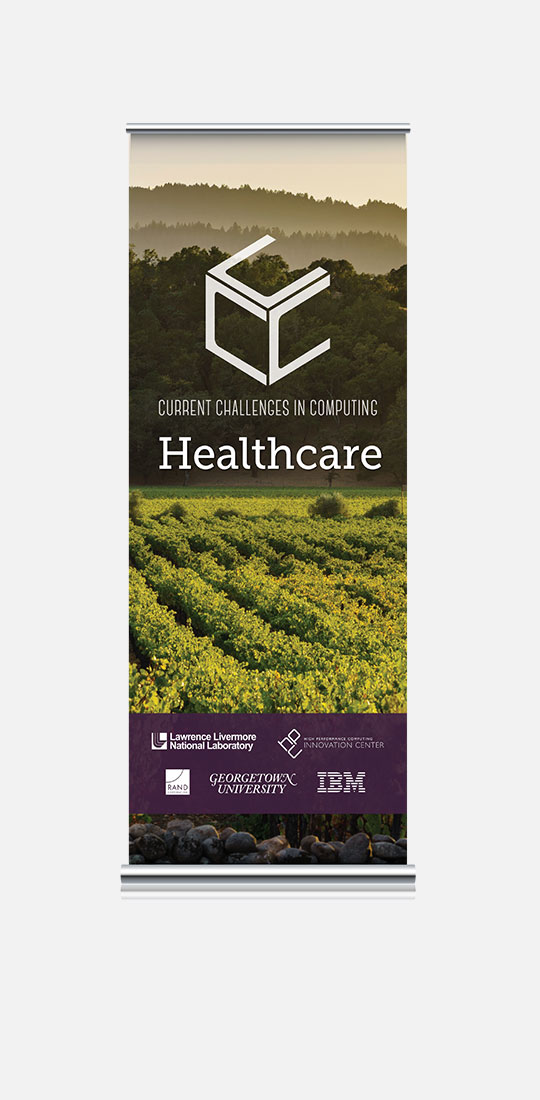
1 Aug
2010

Website design refresh

Client: OCS HomeCare

There was an internal decision to move the website to a new CMS, one that would better integrate with other software and allow for a bit more flexibility. This gave me an opportunity to refresh the design and add a few features that I’d been wanting to integrate. Among these, a slider banner on the homepage that would allow us to more effectively use that real estate and integration of some of the social networking sites.

15 Jun
2010

Direct mail postcard

Client: OCS HomeCare

We needed to do a direct mail postcard for a campaign highlighting the time-sensitive nature of a product addressing a government-mandated change in the industry. A lot of the other agencies were focusing on a scare-tactic approach, so we went a different direction. I like the way this image compliments our branding colors. It transitioned nicely into banner ads on the website as well.

9 Apr
2010

Logo Design

Client: Blitz Marketing

I was hired to design a logo for a new marketing firm, specializing in mid-stream marketing (basically filling the gaps in their client’s marketing departments, doing special projects, etc.) The company is run by some fabulous, dynamic women. This, combined with the World War II associations of their name, made me look for something bold with hints of vintage and sophistication with their typeface and color selection. The symbol adds the sense of forward movement and gives it a dynamic quality.

23 Mar
2010

Logo redesign – Hospice Leaders Project

Client: OCS HomeCare

I needed to re-design the logo for an industry-leading board of advisers in the hospice space. I modified the icon from the hospice data sheet and streamlined the type treatment. I wanted to give it a more sophisticated, modern quality.

Here’s what we started with:

And here’s the new and improved version:

10 Mar
2010

Product datasheet system

Client: OCS HomeCare

I needed to design a system of product datasheets. It needed to be able to be mixed and matched for the different types of audiences that the company addressed. I utilized a system of icons to tie them together and made different sheet heights so that they could be stacked in a folder. We had blank sheets printed at a local printer, so that content could be updated as needed.

Featuring my fabulous icons:

The folders were a basic gloss white folder that we ordered online, but with an added twist.
I had custom vinyl decals with the company logo done in gloss white and applied them to the folders:

The end result is subtle, but sophisticated:

9 Mar
2010

Product icons

Client: OCS HomeCare

I needed a series of icons that would unify our collateral system. I started by brainstorming concepts with the rest of the marketing team and then expanding them into various illustrations that we then sent around various departments of the company for feedback. The result is a clean, graphical representation of the various solutions provided by OCS HomeCare. I’ve shown them here both in black and white and paired with their corresponding brand color.

23 Feb
2010

Promotional item/packaging

Client: OCS HomeCare

We wanted to promote a product that deals with a “blackout” of information that was temporarily not being provided by a government agency. So, we came up with the idea of little key-chain flashlights with our company logo on them. In order to make them look a little more special, I also created a series of labels to put on the outside of the boxes.

15 Feb
2010

Company overview booklet

Client: OCS HomeCare

We had the opportunity to include a marketing piece in a trade show’s registration bags. I designed this little booklet to stand out, with it’s bright colored cover and strong use of type. The unique size will also stand out among the more traditionally sized brochures. A small run of these were produced in-house and then a larger run was done by a local printer.

5 Feb
2010

Company meeting booklet

Client: OCS, Inc.

For the first quarter company meeting, the CEO asked me to design a booklet that would outline the talking points of the meeting, using the theme: “Leaning into Success”. She wanted something “cool” that employees would want to hang onto. I had a very quick time line to turn this around, so I decided to do a folded piece that we could print in-house on tabloid paper. To make the theme work, I looked at sports imagery that supported the leaning metaphor, such as skiing or surfing. I selected the cover image because it complemented our color scheme and made the booklet so inviting to pick up.

30 Jan
2010

Tradeshow product banners

Client: OCS HomeCare

Because the company attends numerous tradeshows throughout the year, we wanted a series of banners that would allow us to provide more targeted messaging. Because our booth design color is so saturated, I chose to do the banners using our branding colors on white backgrounds.

Website design refresh

Website design refresh

Client: OCS HomeCare There was an internal decision to move the website to a new CMS, one that would better integrate with other software and allow for a bit more flexibility. This gave me an opportunity to refresh the design READ MORE…

Shopping cart interface design

Shopping cart interface design

Client: Dentra Dentra needed an interface design for a fairly complex online shopping cart. Coding was done by contract developer, utilizing an existing e-commerce solution. I wanted the cart to have the same look and feel as the website to READ MORE…

Website design

Website design

Client: OCS HomeCare In addition to the corporate site, we also launched a site for OCS HomeCare. (We launched a site for Dentra at this same time, so it was a very busy time for yours truly!) To facilitate easy READ MORE…

New website design

New website design

Client: OCS, Inc. As part of the re-branding of OCS, we needed a corporate website that would separate the brand from its previous incarnation as a home health company and allow potential investors to see the broad range of offerings READ MORE…